7 Tips to Boost Your Site's Conversion Rate Using Images
Images not only add life to a website, they also make it convert better. People no longer want to browse a website - they want to experience it. Using the right images can boost your site's conversions and get you to connect better with your target audience.
However, you still find many websites unaware of the importance of images when it comes to getting the most out of existing traffic. Below are some proven tips to help you boost your conversion rate by intelligently using images throughout your website.
Tip 1 - Emotions Rule
Many people buy for emotional reasons. If you make them feel just right, they'll take action. The same rule applies when choosing images for your site. A positive image brings out positive emotions. It could be a smile, a smirk or a gesture. Emotions are powerful, and they work.
Your customers and prospects aren't stupid. They know what you're trying to convey, they see it. Make them feel good, happy, proud, wanted - they'll agree with you and connect better. The perks of leveraging emotions can be very powerful, but it's how you do it that matters.
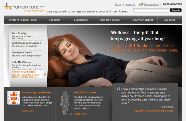
Human Touch is a company that sells massage and wellness products. Their website very intelligently uses images to convey their message. They're not only showing the product, but are also letting their customers get a feel of it.
The image used here clearly expresses joy and happiness. It gives their prospects a fair idea of what they can be experiencing. They could have simply shown pictures of the chair without someone using it, but they took it a step further to show the relaxing effect of the product.
Tip 2 - Consider Using A Mascot
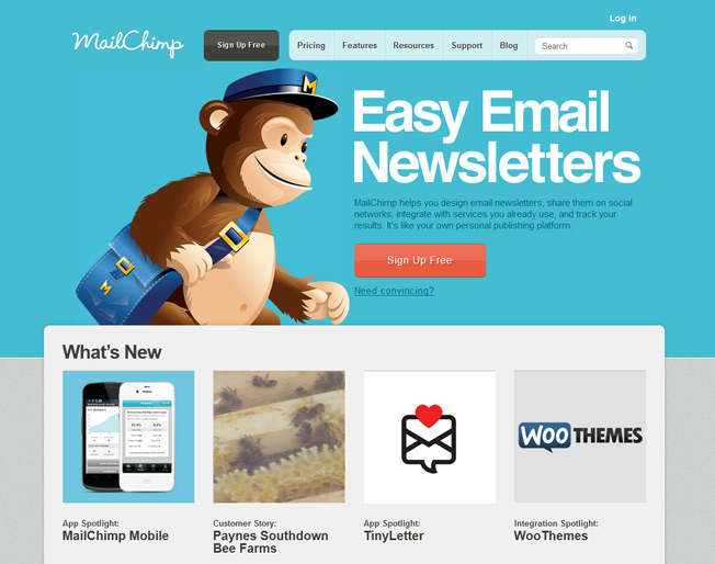
Ever noticed your favorite site with a little cartoon? Site mascots are highly popular these days. Websites and blogs are using them for branding. They are being used to create a bonding experience with the visitors. They're helping sites create a strong image in their audience's mind. But how does a mascot help you convert better? Here are a few ways:
I. A mascot can solidify your marketing motif.
II. A mascot can have a much more memorable branding effect:
III. It's much easier to create a desired emotional effect:

Look around, you'll find sites with various types of mascots. Most of these sites are successful. And it doesn't even cost you a lot to get it done for your site. Lots of creative designers out there will agree to create one for you at an affordable price.
Tip 3 - Give Your Images A Human Touch.
Boost your website's conversion rate by using human faces. They get your prospects to focus more and this causes them to draw towards a common point of interest. It doesn't get more real than that.
Medalia Art is a site that sells art. Nothing spectacular about that, but the photo versus painting test they did is worth noticing. The website, which is an online art shop, presents paintings from various artists right on their homepage. During their A/B testing, they swapped the paintings with the photo of the artist. Their aim was to have an increased user engagement.
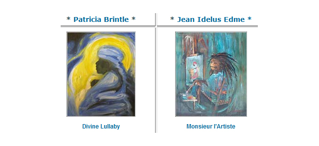
Paintings swapped with human photos.

Making this small but relevant change sent their conversion rate through the roof - something they didn't expect. Their site experienced a whopping 95% increase in conversions!.
Tip 4 - Think Out Of The Box.
Today's technology allows you to do so much more - leverage it. You are only limited by your imagination. People want to see something new, even on websites. Make your website scream "I'm different" with your images.
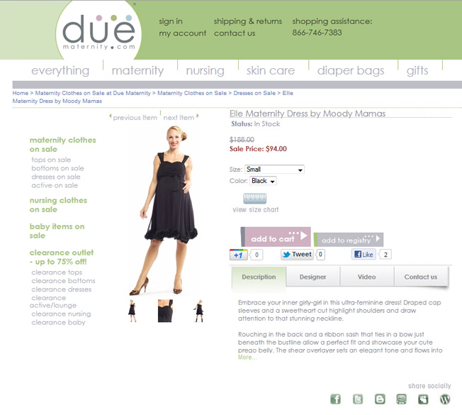
Due Maternity, an online retailer targeted towards pregnant women, knows what it means to think out of the box. In order to give their prospects a real feel of their products, they did something unique. Using advanced "dynamic image technology", the website used images that you can spin around - 360 degrees.
The result? The pages that had these rotating images outperformed the standard two dimensional ones. And their conversion rate for these particular products increased by 27% - all because of a simple twist.
Tip 5 - Show Validation
What makes TV commercials work? Models, actors, and random people are shown using the product. Praising it, loving it, and going bonkers. That's what make these commercials tick. But the more important question is: Why does this work?
It's simple - people want a third opinion. They want to feel safe before buying something/anything. They want to be convinced. They don't want to make a wrong decision. When they see others happy with a product, they get convinced.
If your website has pictures of your happy customers, your conversion grows. It's a natural process that will never change. Add a dash of testimonials along with their pictures and voila - chances are your conversion rate will automatically go up.
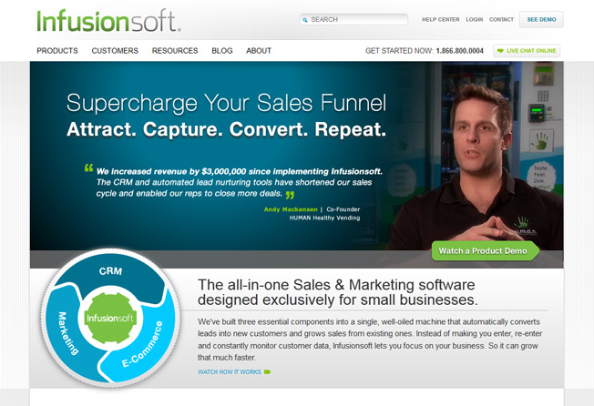
Infusionsoft is a company that sells a complete sales and marketing software tool for small businesses. Their website is professional and well placed. They've strategically used images of customers along with their testimonials on their homepage.
They didn't hide their customer photos somewhere deep down. Why? Because they know how to make their prospects feel at home by showing how trustworthy their product is. Something that's essential to grow your conversion rate.
Tip 6 - It's About THEM, Not You
If you want a higher conversion rate, perfect the art of choosing images. Your prospects are interested in themselves. He or she doesn't care about your product or company. It's the ‘me' factor that ultimately does the magic. Show your visitors they are on the right track. Make them feel comfortable. Get them to experience what you want them to. That will open up doors and get more people to like you - buy from you.
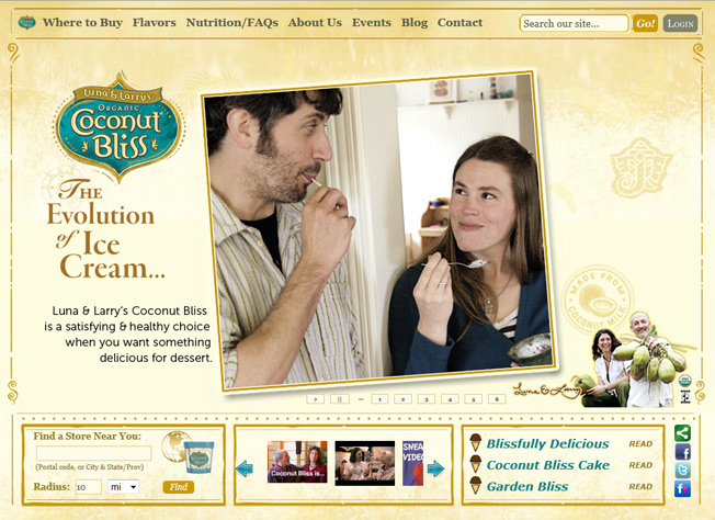
Coconut Bliss sells ice cream. But they're different, they're approach is new. Their product looks and feels more personal than commercial. They call it the evolution of ice cream.
This reflects in their website's design, and the images they used. A very natural picture of a couple enjoying their ice cream. The pictures used on their homepage are relevant and professionally done. If you're an ice-creamoholic you'd be very interested in what they're offering. Just because the site uses the right pictures to communicate the right ideas. They didn't use any pictures to ‘decorate' their site, but meaningful ones.
Tip 7 - Stop Using Bad Stock Photos
The 90's are gone. The web 1.0 era has ended. This is the social age of the Internet. People don't look at the web like they used to. They're more connected than ever. And educated. What does that have to do with images and conversions?
People can tell if you've used a cheesy stock photos.
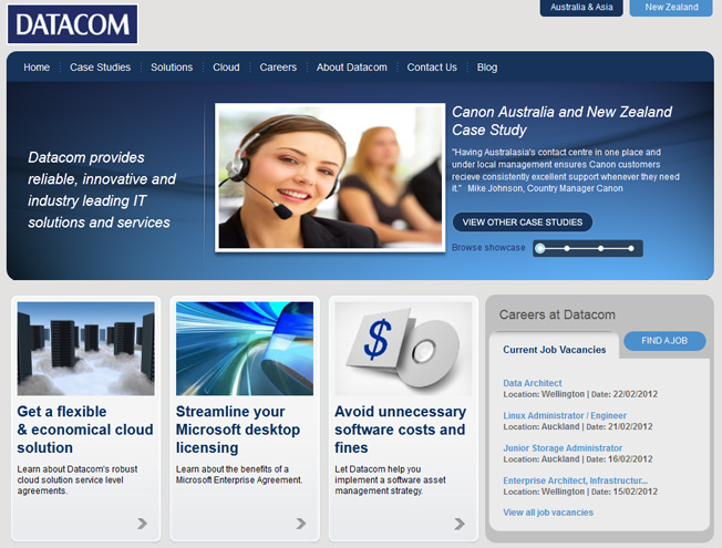
They used to be a rage back then, but not now. Your prospects will know you're trying to fool them with people shaking hands in suits.
So in order to get a higher conversion rate today, you need to do the opposite. Choose stock photos intelligently - even if you have to spend more money.
Your site has to look professional enough to convert better. If the stock photos you go for look obvious, you get a thumbs down from your visitors. Not good. Your aim should be to send a positive message to your audience. Be smart and go for stock photos that you know will be right for your site, in every way.
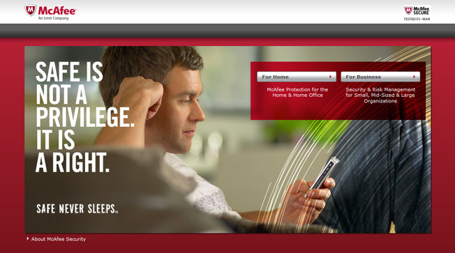
Who isn't familiar with McAfee? The software giant that builds anti-virus solutions. Do you see how they've used an overpowering image on their homepage? Something that not only relates to their message, but also looks professional.
What they used is a high quality image, which may or may not be a stock photo, but it does not look staged, or cheesy. It looks real and authentic, and is adding real substance to the site. Bottom line: using the right stock photos on your own site can make a difference to your conversion rate.
Originally published here.
Choose Font Size:
Recently Launched Sites
Cam-Bag.Com
Do you love to take outdoor photographs? Be prepared with one of the Camera and Laptop Bags from Cam Bag. With storage solutions, organization, safety, and security, you will be ready for anything.
Contact Us:
Phone: 647-477-2992Email: info @ CmsBuffet.Com
Helping You Achieve Web Visibility.

