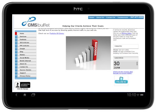
Why Your Website Should Be Tablet Friendly

The great thing about technology is that it is always changing and improving. The drawback? You need to change with it. This is especially true if you are a business owner. But it isn't just you that needs to adapt with technology - so does your website. If you have a website for your business, it may be time to make some changes.
The sales of tablets are on the rise. In fact, the sale of tablets is expected to grow a whopping 58.7% in 2013 over the previous year. Believe it or not, more tablets are currently being sold than desktop PCs. It is clear that the way people are searching the web is changing. There are a few reasons for this change. Tablets are portable and convenient, for starters! Many consumers enjoy being able to take a tablet with them wherever they go, rather than lug around a laptop or go home to sit at a desktop computer. The convenience factor, combined with the fact that tablet prices are dropping, the increased varieties and screen sizes available, and the fact that tablet technology continues to improve, equals a changing market.
Since there are more tablets sold than desktops, your website must look great on tablets. The way that many people are browsing websites is changing. This means that your website needs to adapt to that change in order to be successful. If your website is slow to load, the text is too small, or if it is formatted incorrectly for a tablet screen, you may lose out on a large potential audience. This is why it is important to ensure that your website looks great on a PC and on a tablet.
How can you do this? Well, there are a few different ways that you can improve the way your website looks on a tablet screen. The first is to increase your default font size. You don't want people to have to keep trying to zoom in order to read your web page. This can make it frustrating to read the content on the page, and people may not want to bother. The last thing you want is for someone to think, 'I'll look at it when I'm on the computer,' - because they won't. By the time they sit down at their PC, they will likely have forgotten. So, you want to make sure that your website is as accessible as possible wherever they are. It is also a good idea to increase the space between lines to 1.5 so that the text doesn't look too cluttered and overwhelming on a tablet screen. You may also want to consider making your website touch friendly. This means, if you are using a tablet, you can easily click a link or button - without pressing a bunch of other links you don't want at the same time. These are some small changes that can make a big difference for your audience.
Your website needs to be tablet friendly. Don't alienate interested web browsers by ignoring changes in technology! It is important that your website looks great on a tablet, loads quickly, and is easy to navigate in order to keep readers interested. By making some small yet effective changes to your website, you can ensure that your page always looks good.
If you are interested in learning more about making sure your website looks great on tablets, or other SEO services, feel free to contact us at: 647-477-2992. At CMS Buffet, we understand how to improve the visibility of your online business.
Choose Font Size:
Recently Launched Sites
Cam-Bag.Com
Do you love to take outdoor photographs? Be prepared with one of the Camera and Laptop Bags from Cam Bag. With storage solutions, organization, safety, and security, you will be ready for anything.
Contact Us:
Phone: 647-477-2992Email: info @ CmsBuffet.Com
Helping You Achieve Web Visibility.


